


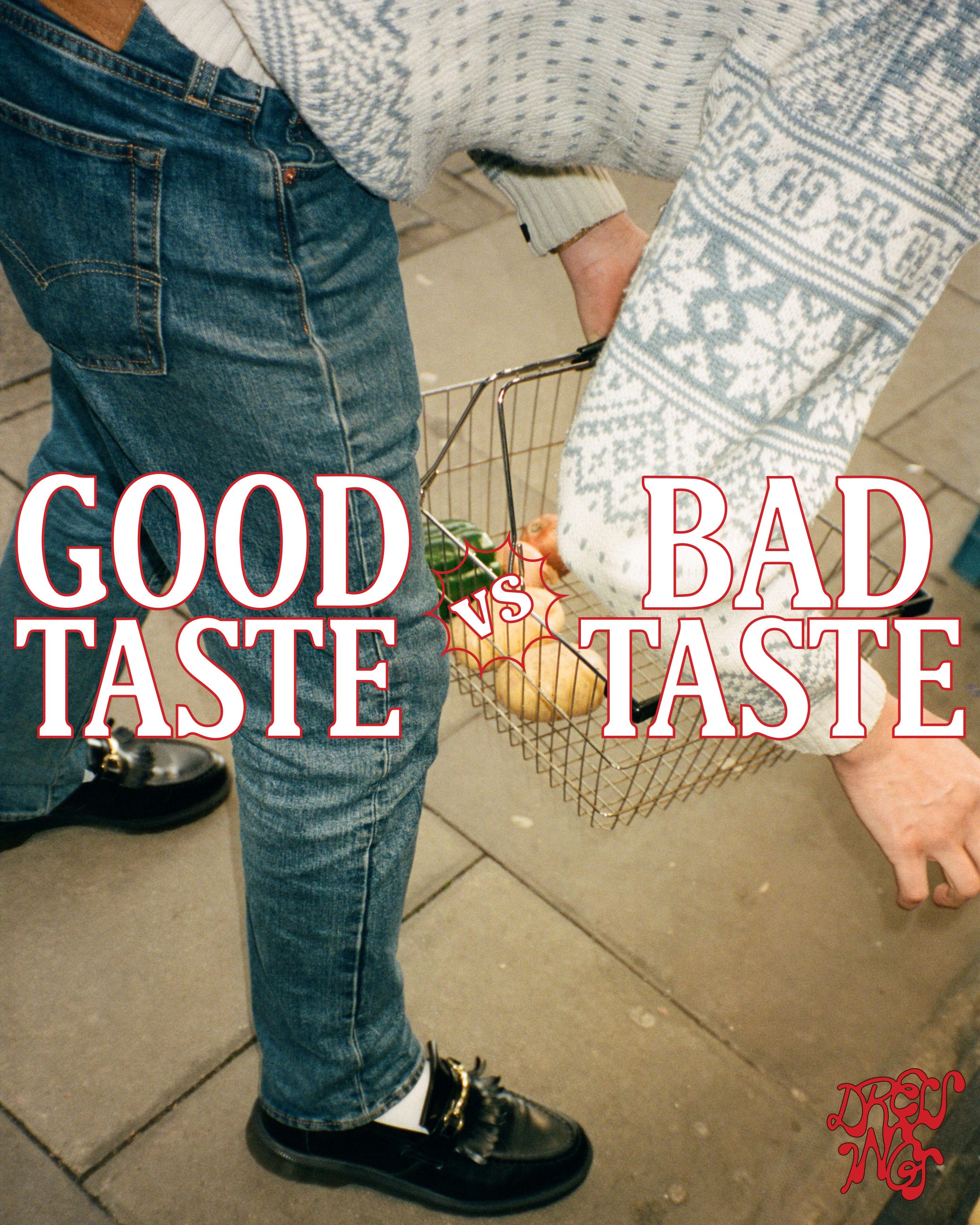
GOOD TASTE vs. BAD TASTE
GOOD TASTE vs. BAD TASTE
Plus posting schedule updates!
Hi everyone! I’m excited to try something new with you this week. When I was coming up with the concept of Dressings, I was doing a lot of research for my MA thesis. I looked into many different theories and concepts before developing this idea, and I love process just as much as I like outcome (if not more). I want to share some of the things I came across, so I’m going to brush the surface today with this issue, Good Taste vs. Bad Taste.
Posting Schedule Update!
Before we dive in, let’s talk posting schedule. As of now, I post an issue a week. This has worked well the past couple of months, but things are shifting — I’m starting to work more (yay!) and am preparing to move back to California from London. The quality of each issue is really important to me, so I’ve decided to start posting every other week rather than weekly :) Ok! That aside, let’s look at taste.
How do we identify what is good taste vs bad taste? The idea of taste itself can seem enigmatic and tacit — you have it, or you don’t. You can pick up a bag of trendy coffee and think it’s better than it’s counterparts solely based on the design put on the packaging. But why is it good? Where does it come from? Who makes the rules for good taste? And finally: do they have the authority to decide, and how do they reinforce that authority?
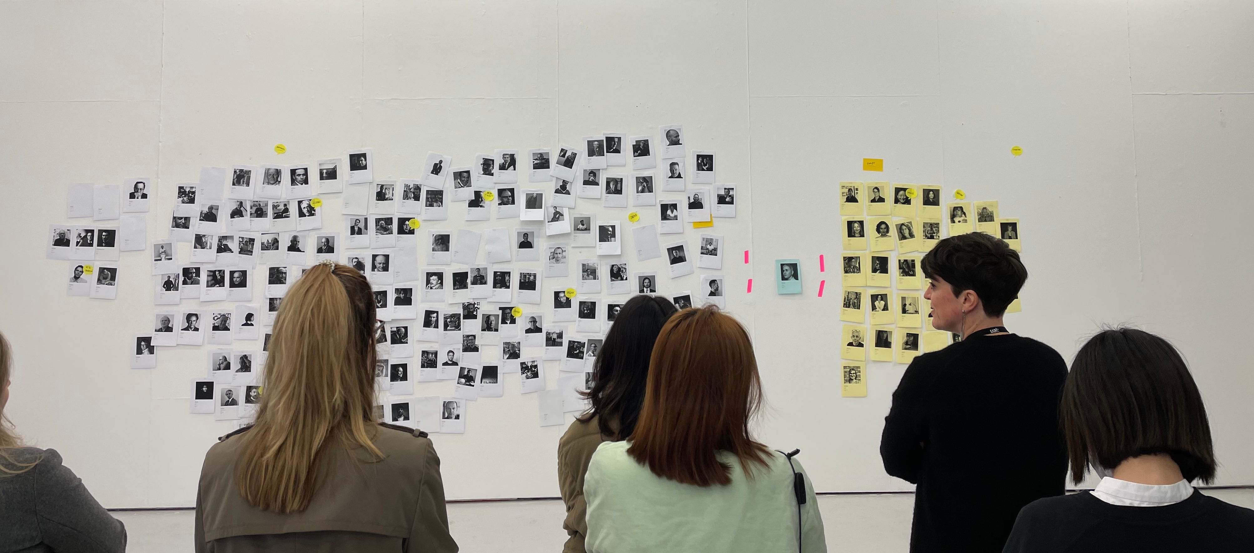
Let’s look at this through the lens of design. I was in a class once at my art university where my professor printed out the titles of each graphic design book we had in our extensive art and design focused library. Along with the titles came the names of the authors, their gender, race, and where they were from. Using one of our classroom walls, we took turns organizing the books by each of these categories, and what we found was that though it was a prestigious art school with an extensive library full of books by designers, there was very little representation. It was dominantly western, white, and male. Is this because the only good designers out there are western, white, and male? Or is it because there’s so few talented designers from other backgrounds?
Neither of these thoughts are true. OF COURSE there are incredibly talented designers from all different parts of the world with various backgrounds, but we’ve been taught to value, celebrate, and center the work that come from white, Eurocentric designers, while silencing others. In turn, we’ve created an understanding of what “good” aesthetics are, but one that is unequal and lacks representation.
This is an intersectional issue. Class, ability, sex, gender, and sexuality are all present in our aesthetic choices. When we choose to categorize design outside the western norm as “tacky” or “tasteless” we’re at risk of reinforcing inequality and oppressing these groups. Kaleena Sales, in her piece Teaching Black Designers featured in Ellen Luptons book Extra Bold, discusses how class is prevalent in design aesthetics:
“Consider how experiences with wealth and poverty seep into our design aesthetic. If someone grows up poor, in a family that struggles to make ends meet, that person might view wealth in a fantastical, idealistic way. If asked to design a logo for a financial institution, they might opt for a representation of money that matches those idealistic feelings, such as. . .gold, extravagant, glitzy, big! Conversely, if a person grows up well-off, where having lots of money is normal, then their design might be quieter and more corporate. The latter is more universally accepted as “good” design in most classrooms and design spaces. When thinking of how often a student is asked to design something and make it look “expensive,” or “cool” or “trendy,” it becomes clear how the cultural interpretation of those words will affect the fonts, colors, and symbols used to express those concepts.”
I’m barely brushing the surface here, but here’s what I’m trying to communicate: how we value different aesthetics and tastes is not just something we inherently have, its something we learn. If we’re constantly reinforcing the same looking things as “good”, we risk creating an echo chamber of design. I can speak to the world of design as a designer, and recognize that it’s a powerful tool that doesn’t just reflect our aesthetic value, it has the capacity to reinforce the binary, racism, classism, sexism, homophobia, etc.
As I’ve worked on this project, I acknowledge that I’m featuring people who are already within my world, but I’m working to highlight people who have vastly different tastes from one another to prove this: Good Taste doesn’t have one look or feel. It’s something that can be celebrated on an individual basis.
That’s all for today!
If you enjoyed learning about this and want more, let me know!! We’ll kick off the new posting schedule next Friday with a regular Dressings issue.
Thanks for reading! Until next time. <3
So much to think about- thank you for sharing this issue. A wonderful challenge for current students to add a whole new dimension(s) to design to share voices previously unheard.